The Hero component is perfect for creating impactful first impressions. It supports background images, overlay opacity control, and multiple call-to-action buttons to drive user engagement.
A more compact hero component designed specifically for inner pages, providing consistent branding while taking up less vertical space.
The Features component is ideal for highlighting key features, benefits, or services in a visually appealing grid layout with icons and descriptions.
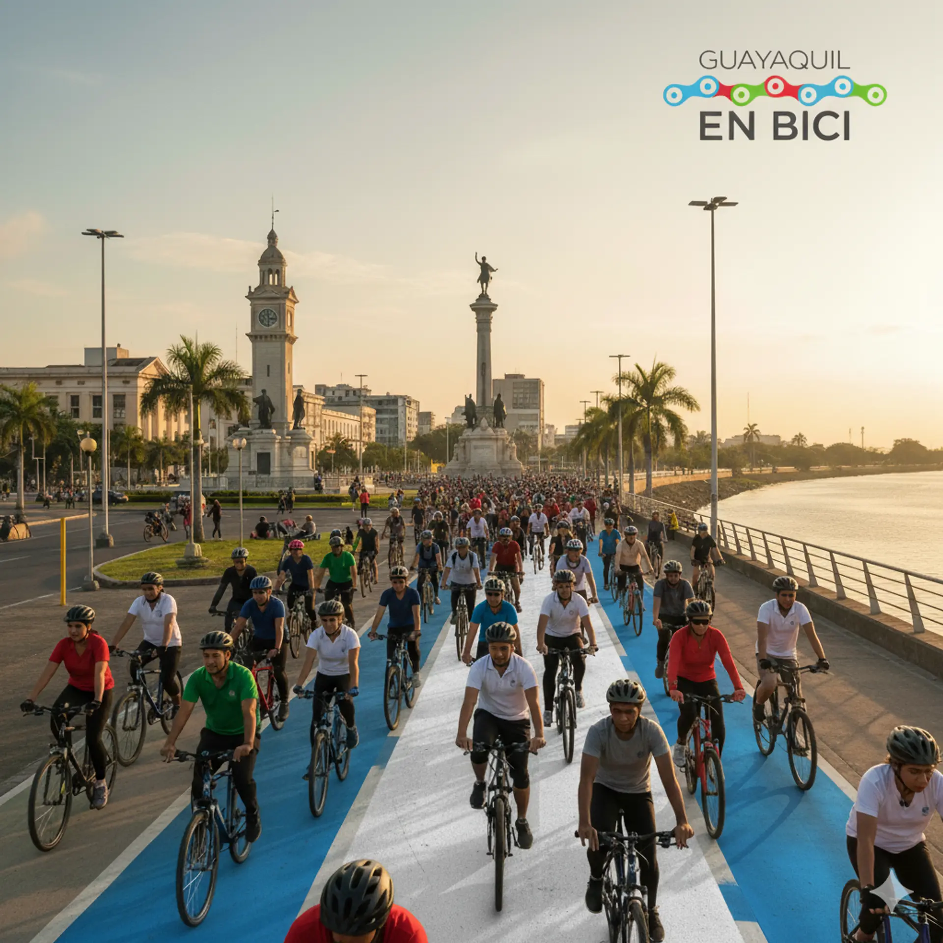
Una red de ciclistas urbanos comprometidos con la movilidad sostenible en Guayaquil
Masa Crítica mensual, Día Mundial Sin Auto, Alleycat y más actividades para todos
Trabajamos por políticas públicas que promuevan el derecho a circular en bicicleta
Talleres, charlas y recursos para promover el ciclismo urbano seguro
Conectamos ciclistas, autoridades y ciudadanos para construir soluciones
Todos son bienvenidos: diferentes edades, géneros y niveles de experiencia
The RecentPosts component automatically displays your latest blog posts or articles, helping drive traffic to your content and keeping your site fresh and engaging.
No posts found.
The SplitPanel component allows you to create beautiful side-by-side layouts with text on one side and images on the other. Perfect for product showcases, about sections, or feature highlights.

The CTA Banner component is designed to convert visitors into customers with compelling headlines, persuasive copy, and prominent call-to-action buttons.


Titan Core is designed for speed and efficiency. Our lightweight framework ensures fast load times and smooth user experiences.
Color Schemes
Core Bundle Size
Pre-Built Components
Build Time
The FAQs component helps address common questions and concerns, reducing support inquiries while building trust and confidence in your product or service.